Hydrangea with its many overlapping blooms can be a daunting flower to watercolor. This tutorial explores a close-up of hydrangea buds instead. I thought the blooming buds would make it easier, but how wrong I was! There is a sure-fire way to start a watercolor painting on the wrong foot. Find out why as you read on.
A love affair with hydrangea
A few weeks ago, my neighborhood was awash in stunning hydrangea bushes. I was smitten by the beauty and developed a desire to paint these flowers. The Japanese were the first in the world to cultivate hydrangeas, and their love for this plant knows no end. That’s why you can find lush, public ajisai gardens blooming everywhere in the rainy season here in Japan. People flock to hydrangea festivals to admire their beauty.
I’ve seen so many varieties of hydrangea in Japan. White, blue, purple, or pink…even red. Did you know that the acidity of the soil is what determines the color?
The reference photo in this tutorial was taken in the wee hours of the morning. I love the colors that engulf nature during the sunrise hour. The color of the buds in this particular photo was calling me. But I didn’t think about how I was going to paint it. I just went ahead.

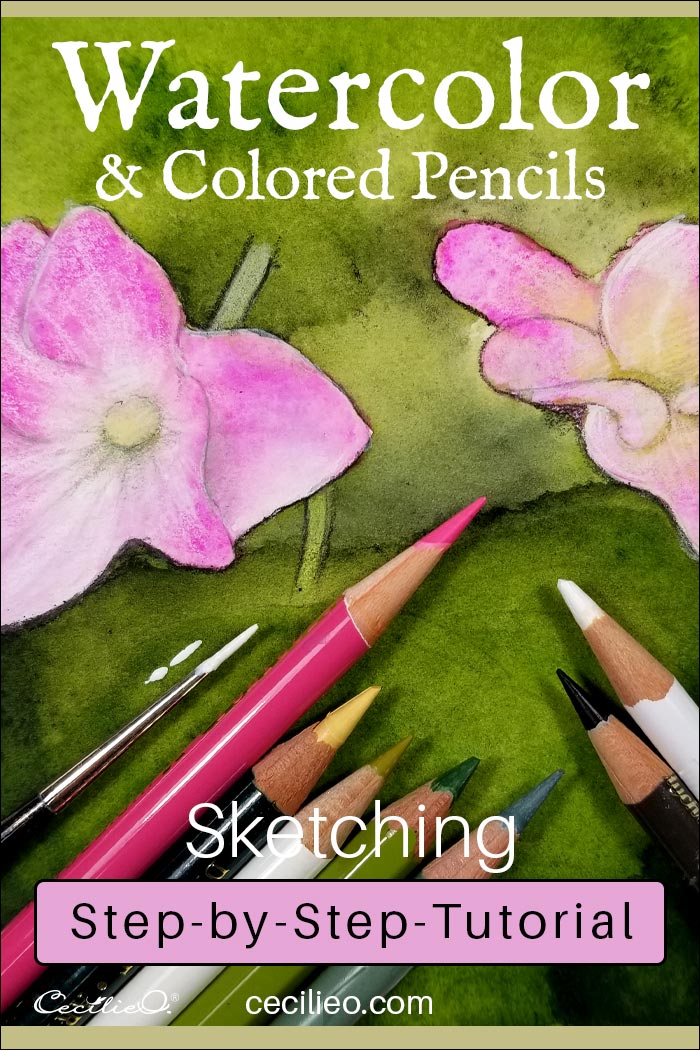
The hydrangea tutorial turned into a sketching exercise. I settled for an unfinished sketch due to frustration.
The drawing process and the first sketch
I first set out to draw the full set of pretty, pink blossoms. The project came to a halt when I was well into the painting. The sheer number of little buds in the center stopped me in my tracks, and in any case, I messed up the pink blooming buds. Lesson learned.

The other issue was the varying shapes and sizes of the pink blooms. Not that easy to get your head around. Also, the little buds in the middle created a significant negative space. The negative space is the green in-between and around the buds. I had to understand that shape too.
So, I resorted to an old trick of mine.
When you have difficulty understanding a shape, it helps to print out the reference photo. Not in color, but black-and-white. You trace the shape. Mind you, you don’t use this tracing for the painting. The tracing is there to tell you about proportions and distances between objects.
The shadows and colors in a photo can distort the actual shapes. When you draw freehand, you look at both the photo and the traced outline.
The image below shows my first sketch to the left and the traced outline at the top. The new, freehand sketch that I ended up using is in the sketchbook.

The drawing process for the second sketch
I decided to use a close-up instead and placed two of the blossoms nicely inside my standard square. By standard, I mean the square I use for all images in my tutorials. By the way, I use Photoshop to place images in that square.

I folded the traced outline to see the horizontal and vertical dividers. This was helpful since I wanted to paint the flowers inside the same square.

My drawing had to be freehand. If you use a drawing traced from a photo for your painting, it becomes stiff and stilted.
Even with the dividers, I got the distance between the two buds wrong. So I decided to make the box more narrow, with flowers sticking out. The flower to the right is not quite right too, but that’s fine.

Lastly, I traced my outline onto the watercolor paper. You can download my drawing for free in One Tree Art Club.

Painting a watercolor base
The pink color you see on the buds does not come in most watercolor sets. My pink color comes in a tube. The color is called “Bright Rose”, and I have two more pinks called “Opera Rose” and “Brilliant Pink”. What’s important, is that you have a rose color that is close to pure magenta.
The green is also an extra color. It’s a big punnet with grass green. Grass green means it’s a bit on the yellow side.

Most watercolor sets come with a “pure” green, that must be mixed with ochre to become grass green. And a tiny bit of black to make it darker. It’s all about experimentation when you set out to mix a certain color. You know the main ingredients but the fine-tuning happens by testing.

I painted the pink first and then the green leaves. When dry, I painted the rest of the green. If you want the pink without green bleeds, you need to wait until the pink is dry to paint the surrounding green. Use a good amount of water for both pink and green.

In the end, I used a hairdryer to dry the green paint. When you use a hairdryer, the water shifts around until dry. That’s what makes for the “river” marks. When it dries slowly, the pigments will distribute differently.
Next, I painted the light green on the blooms. To make the light green color, I mixed in some white gouache. Using gouache means you can paint on top of pink without the pink shining through.

Adding details with colored pencils and white gouache
The left bloom was first out for details. In the center, I drew some light yellowish-green and added some shading with an olive green pencil.
Then, I painted with white gouache. I let the brush move from the center and outward to create fine lines. Use a very fine brush.

The last step was to enhance both blossoms with various colored pencils. You don’t need to draw fine, smooth shading. Be free and make lines here and there.
I used a white pastel colored pencil and white gouache to build the white parts on both flowers. The white pencil makes for subtle shading, and the gouache handles the absolute white.
Use a hairdryer so that you can dry the white paint quickly and get on with the white pencil. It’s a back and forth between the two until you are satisfied.
This method is the opposite of traditional watercolor. I added white instead of subtracting it. The common way to achieve white color with watercolor is to soak up pigments with a sponge. Or, you just don’t paint certain areas. I have used my method of adding white paint on a great number of book illustrations.
As you can see, I stopped short of painting the numerous, tiny buds. I decided this watercolor + colored pencils + white gouache exercise was done. Yay!

The moral of the story: Falling in love with a photo doesn’t mean it’s a good reference photo.
My best wishes for your creativity!


