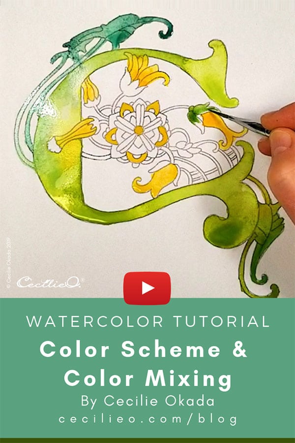
To demonstrate what a big difference color can make to watercolor painting, I have created a second video tutorial for the illuminated letter C illustration. This time around, instead of using pale vintage colors, I am splashing out with vibrant greens and yellow that I picked up from a photo of a beautiful damselfly. I added some watercolor gold paint too.
In this tutorial, I show you how I mix the colors that I don’t have in my ready-made palettes and then take you through the process of painting a composition that works. Distributing colors in a balanced way is half the game. Here’s a link to the first tutorial with vintage colors.
Making your watercolor painting process a whole lot easier
The contrasting appearance of these two paintings of the same illustration demonstrates how much easier it is to create successful artwork when you select your color scheme BEFORE painting. And how much easier it is to express your intentions for the artwork when you don’t need to fool around with color choices while painting.
I hope the instructions in this video are useful to your creative endeavors. Your comments and questions are very welcome- please comment below the video on YouTube.
You can download a free PDF with the photograph and color scheme that I used in the tutorial. It’s in the One Tree Art Club Library. When you sign up you will also have access to all the other free resources that go with my video tutorials, including free line drawings.
Happy painting!
