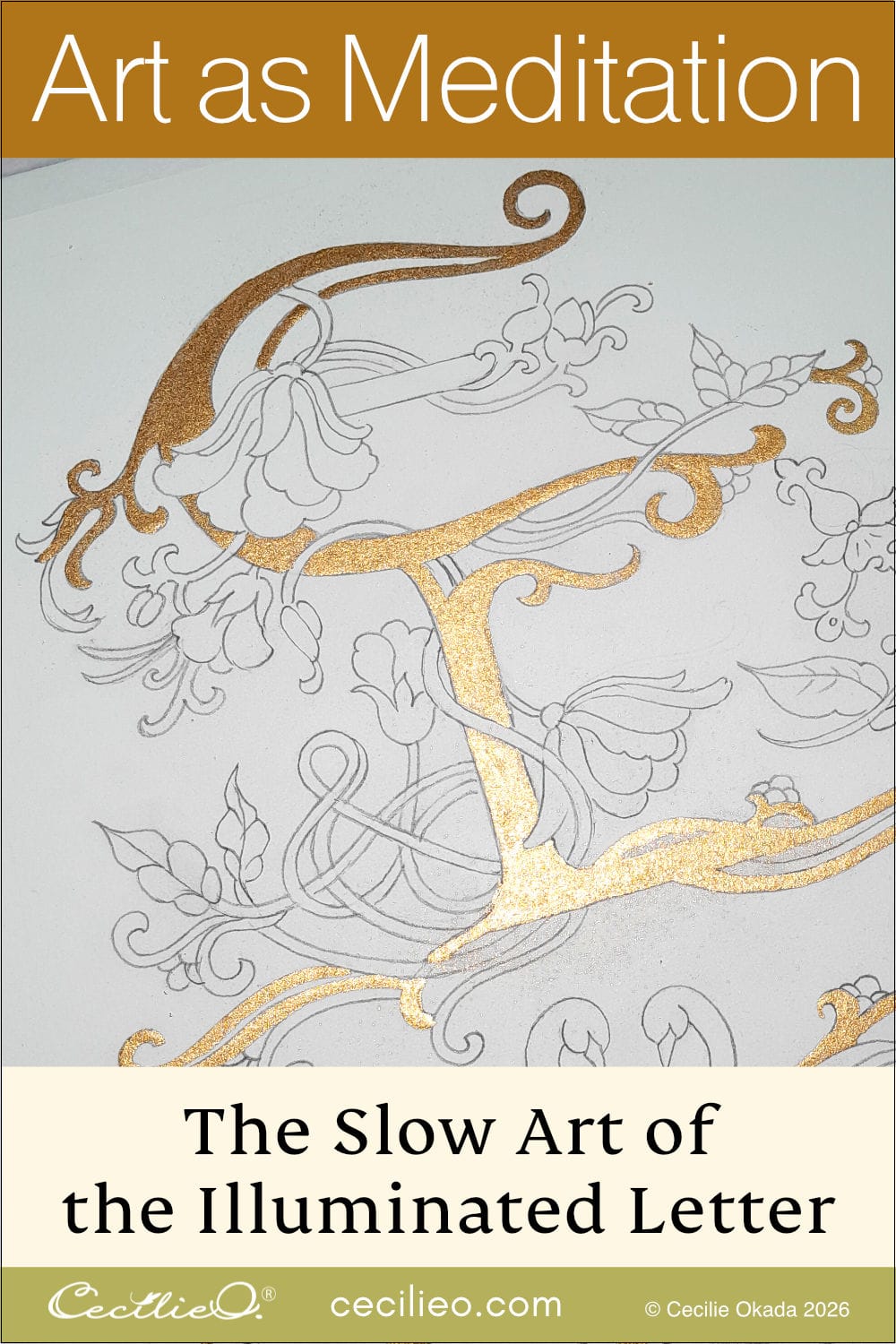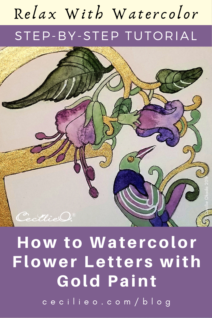
In this watercolor tutorial, you learn how to add dashing decorative flair with watercolor gold paint to a delicate flower letter. The result is a modern illuminated letter inspired by beautiful medieval illuminated manuscripts.
The illustration of this flower letter E may look complex, but the process of painting it is simple. Your main consideration is how to balance the distribution of gold and then the distribution of colors. Choosing to go with only four colors makes it easy and straightforward.
In the tutorial, I’m taking you through each step of this balancing act so that you can learn how the process works. I also show you how I selected the colors and then mixed them since they don’t come in ready-made palettes.
If you want to have a go at painting this illustration yourself, you can download a free PDF of the line art in One Tree Art Club.
You can trace this printable illustration onto watercolor paper. Learn how to trace onto watercolor paper. The tutorial also explains how to print out directly onto watercolor paper.
Here I printed out my illustration on watercolor paper. The original pencil drawing was too small so I drew this clear version with a fine liner pen on tracing paper and then scanned it.

While the flower photo is rather boring, I love the colors. I took the photo with a Nikon camera, but I have no idea how to use the light settings… I used Adobe Color Wheel to select the colors, it’s a great free online tool. Try it with another photo and do some playing around. You can pick up five colors from any photo that you upload.

Your first task is to mix the colors for your artwork. Avoiding hit and miss with colors makes the creative process so much easier and enjoyable. I opted for muted colors in this painting as a contrast to the shimmering gold. If you don’t have gold paint but want to use my color scheme here, use ochre color instead of gold. To learn how to make your own watercolor gold paint, visit this blog post.
Take note that whenever you add white to create a color, the color becomes opaque. It’s the only way to make pastels and the kinds of muted color as the green and pink you see here. Transparent watercolors always look luminous and fresh by nature.

I mixed a small batch of watercolor gold paint for this illustration. Make sure the golden paste is not runny; you need to lay down steady paint in an ornamental piece of artwork like this.

I have decided on the distribution of gold paint. Where to add the gold is purely intuitive; I look for a feeling of harmony as I’m looking at the artwork and then let the brush do the job.

The gold paint must be completely dry before I add regular watercolors. As opposed to my usual technique of painting with loads of plain water before adding color, I do the exact opposite here. I color in first, then add more water to create an interesting distribution of pigments. The reason is that I want to keep colors clearly within the boundaries of the outlines. No bleeding into the gold.

I created a starting point for the distribution of color by making some easy choices: Pink flowers, blue for the bird.

I decided that the plain pink was a bit boring, so I let the blue and pink bleed into each other.

I’m distributing light and dark green purely on a sense-of-harmony basis.

It was difficult to decide on the color for the stamen since they usually are fresh green, yellow or orange in real flowers. But I don’t want to add another color because it will completely change the dynamics of the artwork. I stick to an opaque version of the pink, as opposed to more watery pink elsewhere.

The color of the two lines at the bottom of the letter will act as a unifying element of the design. The first line becomes pink but then I regret it. Adding a bit of water to tissue paper, I soak up most of the pink pigments. A sponge won’t do because space is too narrow.

Adding dark green instead.

I want to make the bird more interesting, so I paint with light green on top of the pink. The light green is opaque because I mixed with white pigments when I created the color.

I give the eye a bit of a 3D effect by adding a blob of gold paint.

Still not satisfied with the now fully green bottom stripe, I add back some pink and let the two colors take half of the space each and then bleed into each other.

So far so good. But I feel that it needs more dynamism.

I pick up a white gel pen and draw lines in a few, selected places. Important to use very sparingly, otherwise it will steal attention from the gold. Not to speak of making the artwork messy and without any focal point.

Lastly, I realize that I need to clean up the black outline. No matter how careful I have been to not spill colors. The sepia (dark brown) colored pencil does the job. I won’t use a fine line pen, because it’s too risky. If a make a wrong line I won’t be able to correct it but a wrong line with a colored pencil can easily be erased. Sepia creates a soft and natural outline, instead of a stark black line.

Finally- all done!
Photographing the finished artwork so that the gold reflection shows is not easy, it never shows the real beauty. But here it is.
My best wishes to your creativity- have fun!

Check out my curated Pinterest boards with beautiful Illuminated Letters and Illuminated Manuscript Art and get inspired! I just can’t get enough of looking at those images. They really knew how to combine letters with ornament and illustration back in the middle ages. No computers, no hurry. Only silent concentration, creating outstanding beauty.


