
Finding good colors for your art project can be daunting. Whether you're painting from imagination or matching colors from a reference photo, getting it right isn't easy. My free color picking tool takes away the guesswork. It helps you generate beautiful palettes in no time.
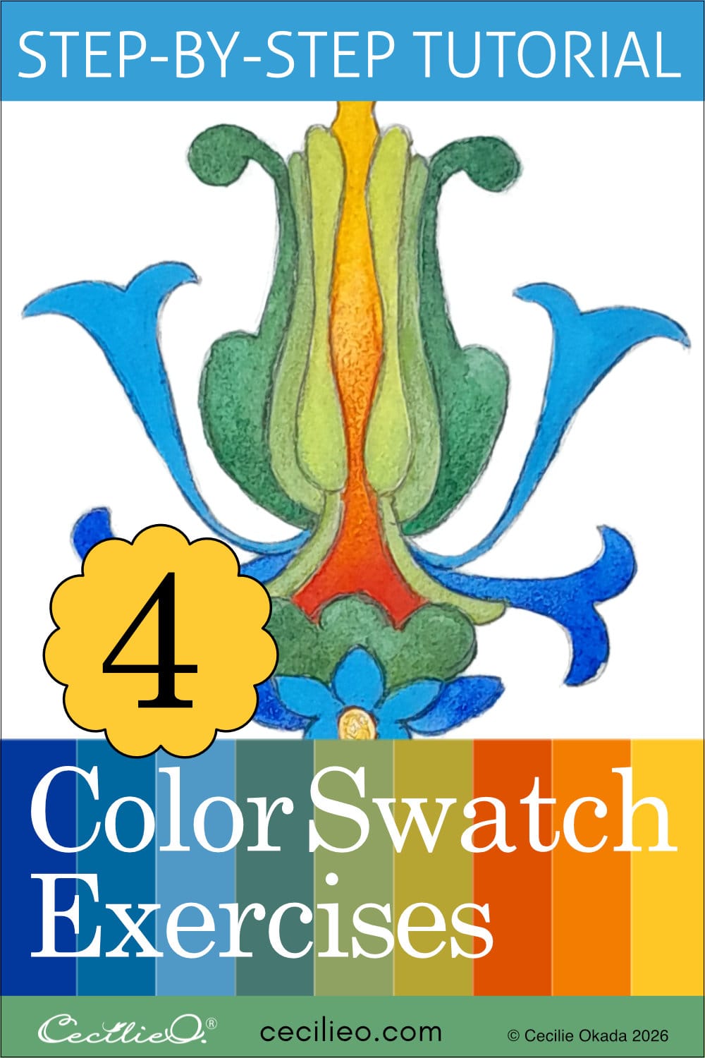
In this tutorial, I also show you how to mix the colors. You learn how to distribute colors in your painting. To simplify the exercise, I have used four of my abstract, ornamental shapes. These drawings are available to Level Up members. Download and trace the drawings, and enjoy experimenting with colors!
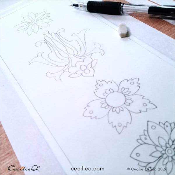
You can also join the free One Tree Art Club. From the free library, select a drawing to download and start playing with color schemes. (Already a free member? Check your newsletter for login details)
Some basic principles of color mixing
Let´s look at the basics of color mixing with watercolors. I follow a few simple principles. Practice these, and before you know it, you can create any color.
Everybody knows that blue and yellow make green, and yellow and red make orange. Many people also know that pink with a little bit of blue makes purple. But what about the rest? How do you make vibrant colors, muted colors, or pastels?
Your colors will always be unique to you
I mix a particular color in one way, and you try doing it the same way. But you get a different result. Colors from paint sets that are not the same will yield different results. When you follow the basics of color mixing, it won't matter. My instructions are just pointers. To learn the DNA of colors, you need to experiment.
Use of water when mixing colors
It is important to remember to use enough water when mixing colors. I often use a paint palette to mix colors. Dryish colors do not mix well.
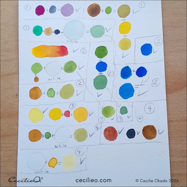
My recipe for mixing colors
Take a good look at the image above to see how I mixed the colors for the four exercises.
Nature is filled with endless varieties of green. You skew a green towards moss by adding any version of brown. It can be ochre, terracotta, or earth brown. You name it. The type, and most importantly, the amount of brown, will yield different results. The type of green you use also matters. Experiment and see what happens!
To create a vibrant green, add yellow. Sun yellow will yield a different result than lemon yellow. How much yellow you add will determine the level of vibrancy.
For blue-green, add some blue. Different kinds of blues will yield a different result.
To achieve a muted color, add white. Experiment with how much white you use. Add a little bit of black to any color, and you also get a muted variant. Even just a tiny bit of black can skew the color.
If you want a pastel color, you can add white to a clean, vibrant color. The more white, the closer to pastel.
My best advice
Experiment!
When you are ready to paint, don't just slab on color and hope for the best. Select and test your colors on a piece of scrap paper first. Painting is intuitive, but some planning makes the intuitive process so much easier.
Color exercise with art shape #1
I took a photo of vibrant beet root leaves in the botanical garden. The automatic color picker found many colors, but not the ones I was after.
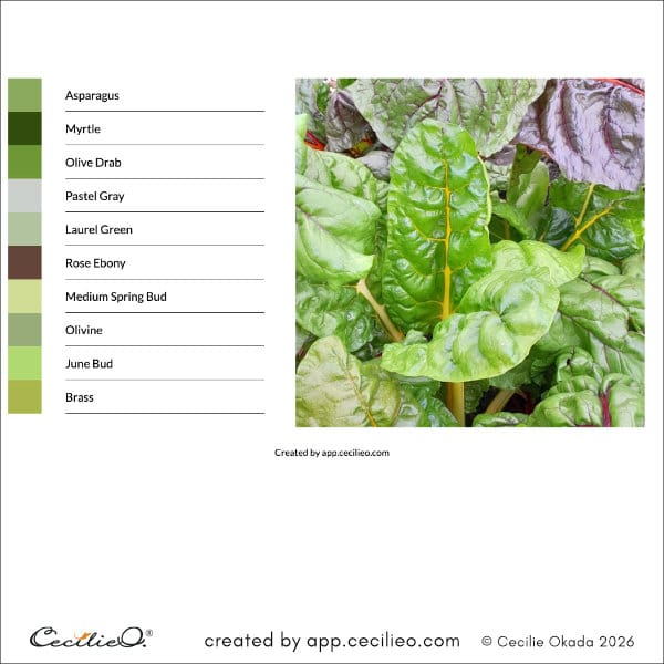
Using the manual color picker, I picked up the colors I wanted. Everybody favours colors in their own unique way. If you picked colors from these same leaves, it would be a different set of swatches.
I usually tend towards an Oriental color palette. It is not a conscious choice. Colors in traditional art and design from Asia have a distinct flavor. What about you- what are your favorite types of palettes?
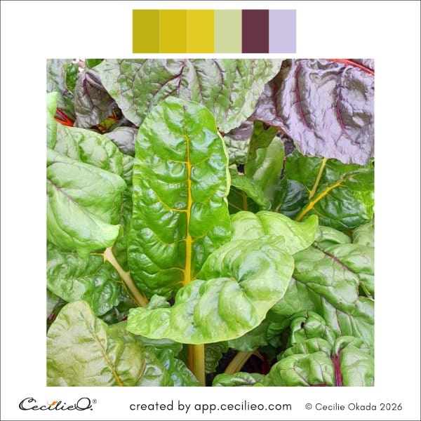
What would this shape look like with dark purple as the main color? It would overpower the lovely green shades. They would become understatements. I decided to let dark purple take a back seat.
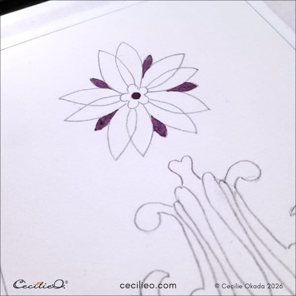
The color palettes gave me a great starting point, but I ended up diverging.
Color exercise with art shape #2
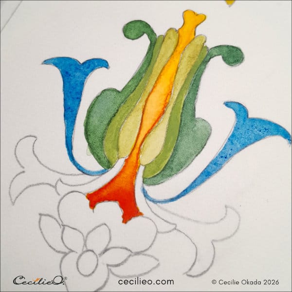
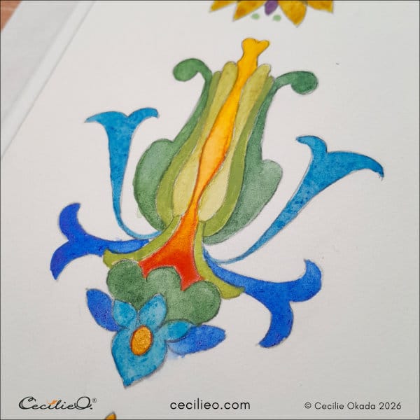
Look at the distribution of colors on these beautiful macaws— a touch of yellow, orange, and red on the face. Then the feathers spread out in greens, moving into blue-green, and finally, brilliant blues
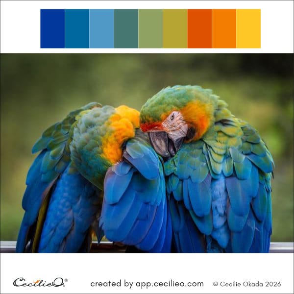
This drawing is more complex than the first one. The complexity allowed me to mirror the movement of colors on the birds. I let the colors move across the ornamental shape.
Color exercise with art shape #3
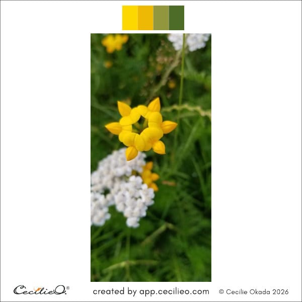
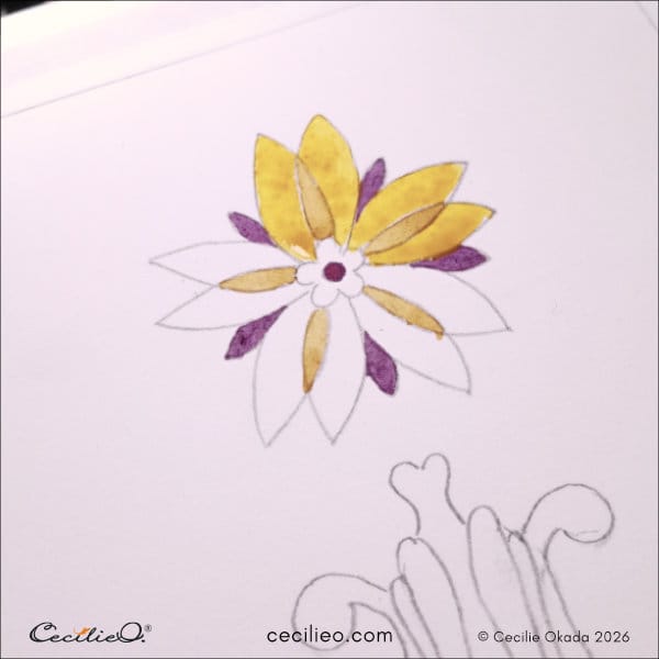
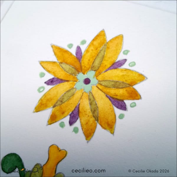
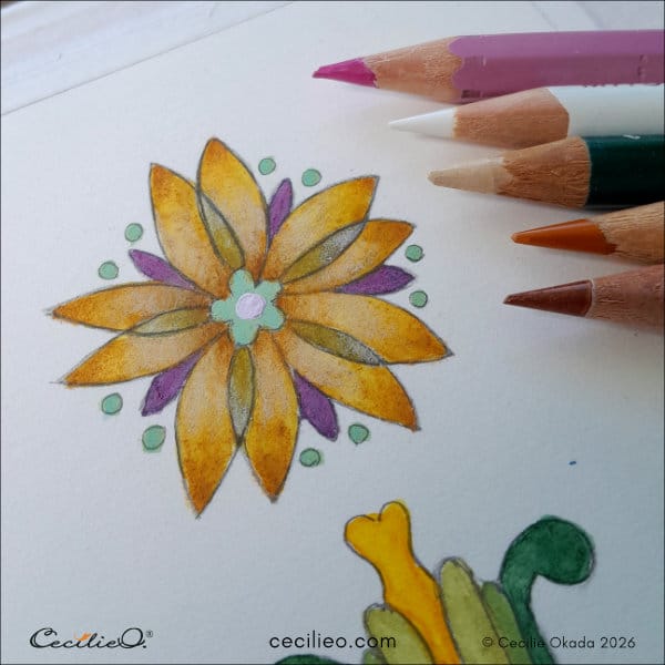
My drawing looked somewhat similar to the pretty little yellow flower. The color scheme inspired the painting of this floral shape.
Color exercise with art shape #4
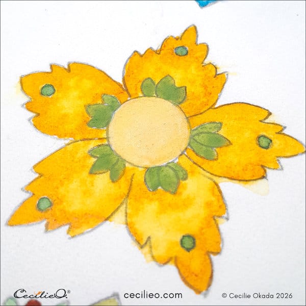
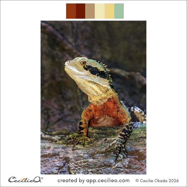
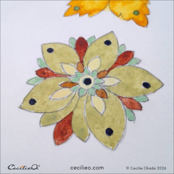
The lizard's colors are almost like an autumn leaf. I find them very calming. Taking in the impression of the color distribution, I painted my drawing. Color distribution in a color reference photo can be a great guide. But always let your imagination take off from there.
Have fun with colors, and happy painting!
You may also like these tutorials:
Birds in Bloom: Mindful Watercolor Painting
Mindfulness in Art: Paint Sparkling, Colorful Fish
7 Creativity Tips to Make Your Artwork Shine