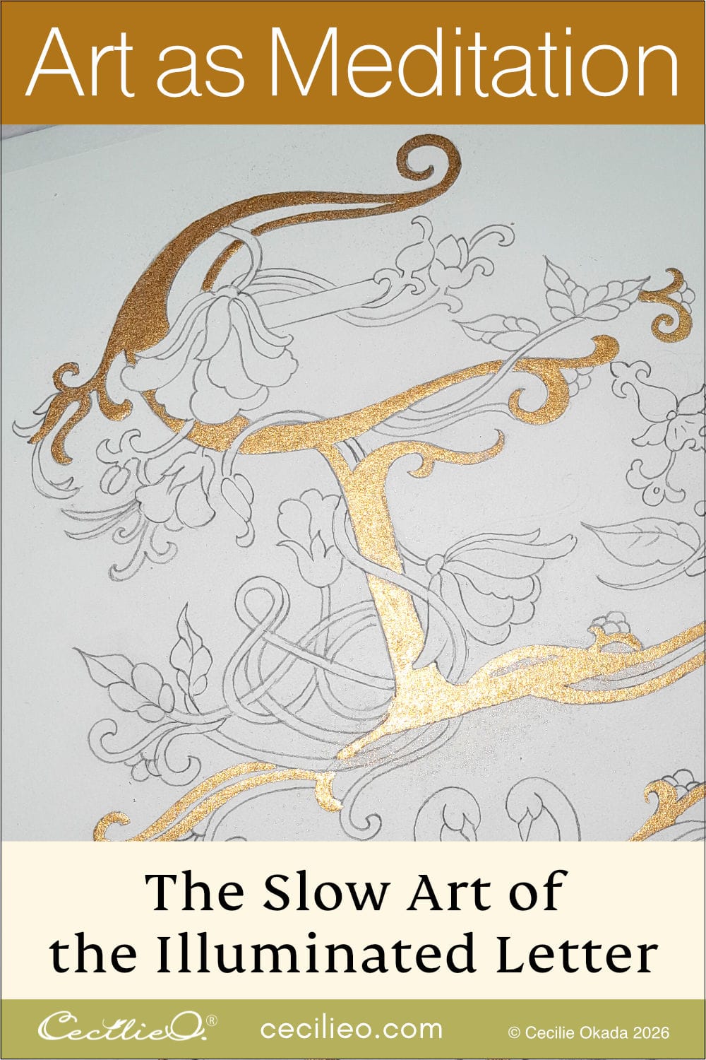

If you are painting a beautiful watercolor flower, how about taking it to a whole new level. Add some watercolor gold. Gold paint is easy to apply, and your artwork quickly becomes a gift that is suitable for any occasion.
In this tutorial, you learn to experiment with gold as a strong element in your composition. A simplified fantasy flower is easy to explore for this purpose. With a more realistic flower, deciding where to apply gold is a little trickier.
You can download my drawing in One Tree Art Club. (If you are already a member, check your newsletter). The free PDF includes a smaller version too that you can use to make a gift card.
Instead of tracing the drawing onto watercolor paper, I have printed it out this time. I used my laser printer. Any inkjet printer will do too, just make sure to let the ink dry overnight. A member of One Tree Art Club mentioned that she lets the ink dry for 24 hours.
You can learn how to make your own watercolor gold paint. You mix gold powder, gum arabic, and a tiny bit of water. Ready-made watercolor gold is also available. Explore both gold paint options here.
Let’s get on with painting.
Step 1: Applying gold paint
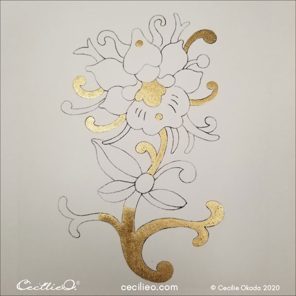
For your composition to have a balanced mesh of gold and colors, start with the gold paint.
Important: You need a separate water container to rinse the brush with gold paint. Use a fine brush for the gold paint, and don’t use it for other watercolors. Make sure that color pigments don’t get mixed into the gold. It will dull the shine.
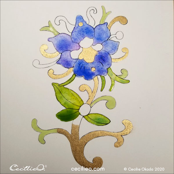
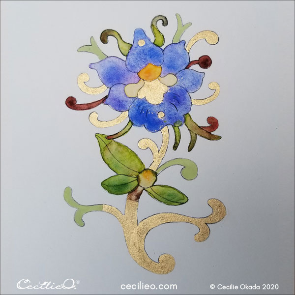
This drawing is not symmetrical, but for a starter, I have applied gold in a symmetrical pattern.
Note the center, two vertical dots, and the four horizontal curves.
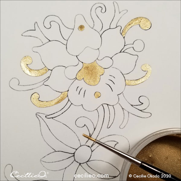
Since the drawing is so unsymmetrical, I’m looking for the next balance point. I choose the stem for its vertical position. The flower head is tilted to the left. To offset this, I paint the bottom right arm and part of the bottom stem. Not sure where to go next, I paint a curve.
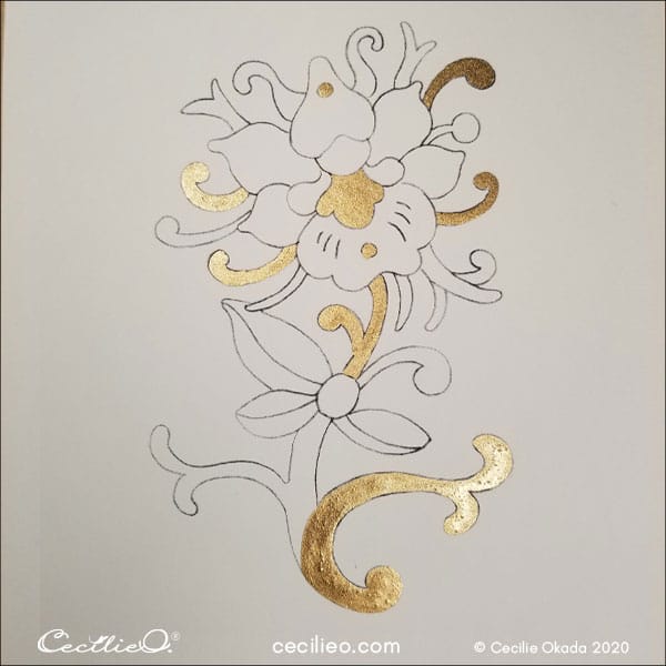
After looking at the drawing for a while, I decided to extend the gold paint upwards and to the left. I am now satisfied that the gold paint is distributed evenly.
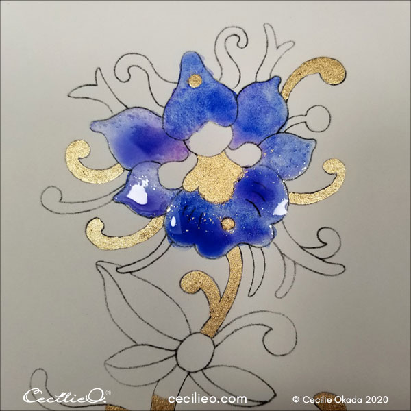
Step 2: Painting the flower head with watercolors
This tutorial does not have a specific color theme as a guide. Instead, I will take you through the steps of developing a palette as you go.
For a starter, I have decided to paint the flower ultramarine blue. Paint the petals with water first, then some blue. Make sure the water does not cover any part of the gold paint.
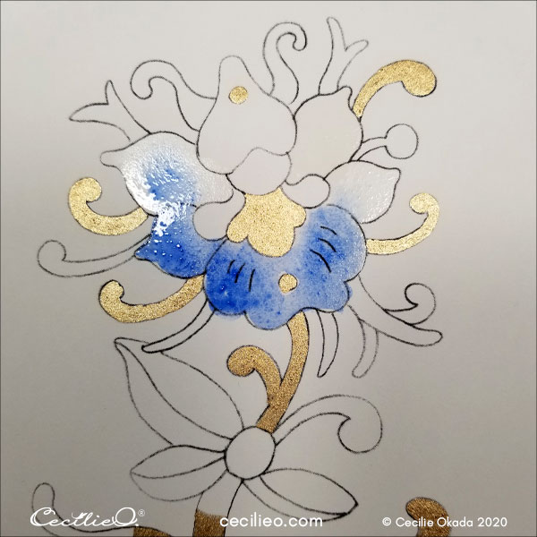
It’s easy to create a beautiful, uneven flow of colors by dipping your brush with a tiny bit of magenta.
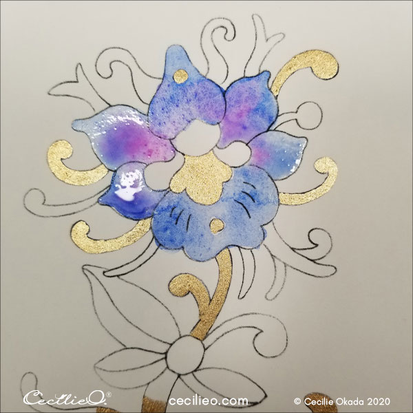
I decide some more oomph is needed to contrast the gold. So I applied more ultramarine blue and tiny tips of magenta.
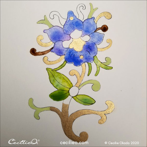
Step 3: Painting the leaves
Next up, the leaves. By now, I have taken a look at my flower Pinterest board for color inspiration. I land on a blend of bright yellowish-green and bluish-green. Together, they create a third kind of green.
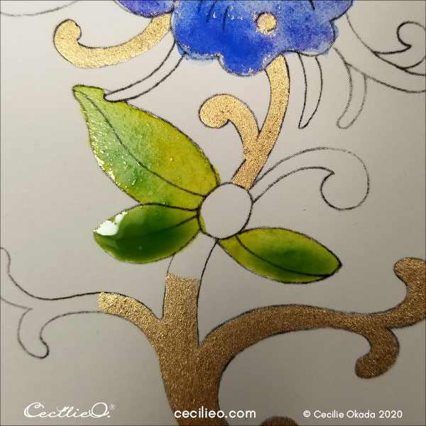
I extended the green to more leaves.
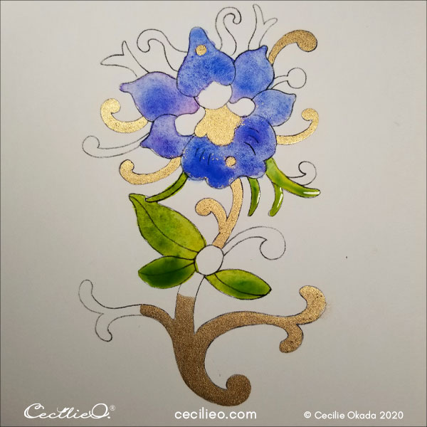
Where to from here? I want to use more green, but need something that will create a contrast. I decide to go light with pastel green. By mixing a tiny bit of green watercolor with white gouache, you get a pastel green that is opaque.
The pastel, opaque green is a nice contrast to the uneven shades of the watercolors.

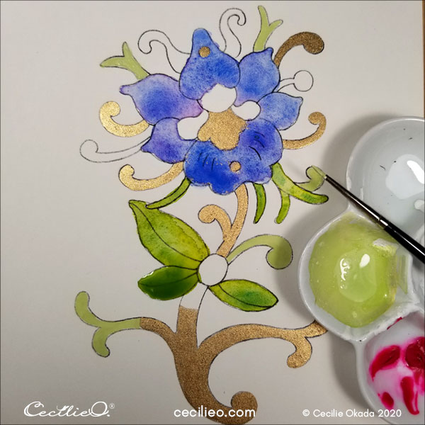
Step 4: Creating a color symphony
Not quite sure if it’s the right way to go, I paint a bit of dark brown. I’m constantly looking for ways to create contrasts. Dynamism occurs when you have contrasting elements in your painting. It can be size, texture, colors, or shapes.
A sun-yellow flower center sets the tone, and a symphony of colors is waiting to play out. Experimenting with mixing deep red and more green and brown, I finally arrive.
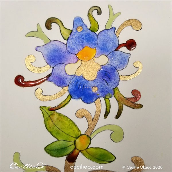
The two white spots in the center are a bit of a headache. I don’t know what to do with these.
Trying different pastel yellows, I’m happy with none. In the end, I leave it at that. By now, there is a faint yellow residue that will have to make do.
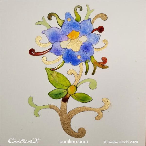
I decide that the painting is complete. No need to redraw the outline. Since the drawing is a printout, the outline doesn’t fade with the application of watercolors.
I have written a guide to art supplies for my tutorials. I hope you find it helpful.